The Wet Tuesday Test: Choosing a Patio Door Colour for a British Garden
Patio door colour is one of those decisions that feels purely aesthetic until the first wet Tuesday in November. In the showroom, every sample looks crisp. Against a real garden, under a real sky, the same frame can read as elegant, heavy, muddy or strangely gloomy. If you are weighing up anthracite, black or Chartwell Green for a 2026 installation, the trick is not to pick a favourite colour. It is to pick a colour that behaves well in the place it will actually live.
Start with the house, not the brochure
Anthracite grey has become the default modern choice for good reason. It is softer than black, pairs neatly with grey windows and handles, and sits comfortably against render, pale brick and porcelain paving. Black is more confident. On a period terrace, a converted barn or a house with black rainwater goods, it can look as though it has always been there. On a small, pale-rendered extension, it can also look like a heavy line drawn around the opening.
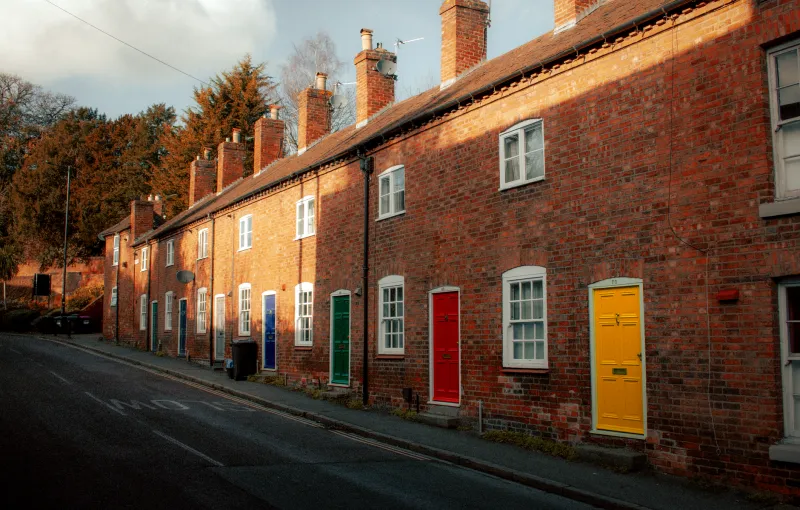
Chartwell Green is the gentler option. It is a soft, heritage-leaning green rather than a bright garden green, and it tends to flatter red brick, cottages, timber accents and leafy boundaries. It can look lovely with sandstone paving and climbing plants. It can also look slightly old-fashioned if the rest of the house is sharply contemporary and the windows are bright white.
None of those outcomes is wrong. The point is to notice what your house is already saying. A colour that argues with the brick, the roof or the front door will always feel like a mistake, even if the sample looked perfect in isolation.
The four-sample trick
One sample is not a test. It is a mood board. Order at least four samples of the same colour from different angles, or four different colours if you are still shortlisting, and live with them for a week. Tape them vertically at the actual door position, not flat on a table. Look at them from inside the room, from the patio, from the end of the garden and from the doorway you use every day.
Then do the wet Tuesday test. Spray the samples with water, or wait for rain, and look again. Dark frames change character when they are wet. So does paving. Anthracite can go almost black in flat light, while Chartwell Green can look greyer or more olive depending on what is reflected in it.
Check the samples at three times of day: mid-morning, late afternoon and dusk. A colour that looks smart at noon can disappear into a dark silhouette by 4pm. If the door is on a north-facing wall, be extra careful. Northern light is cool and flat, and dark frames can make the opening feel like a shadow rather than an invitation to the garden.
What grey skies do to dark frames
This is the bit the catalogue rarely mentions. In a British garden, a dark frame is not usually seen against bright Mediterranean sunshine. It is seen against cloud, damp brick and green foliage. Anthracite and black can look very sharp in that setting, but they also create a strong outline. On a small patio, that outline can feel enclosing. On a large, glazed wall, it can look deliberate and architectural.
Black is the most dramatic of the three. It works best when it echoes something else: black gutters, a black front door, dark window frames or a crisp industrial interior. If everything else is white uPVC and buff paving, black patio doors can look stranded. Anthracite is more forgiving because it has a little softness in it. It reads as grey rather than as a hole in the wall.
Chartwell Green is the one that tends to make a garden feel calmer. It blurs into planting without vanishing completely, and it is less harsh against red brick. The trade-off is that it can look less contemporary if you are aiming for a clean, minimalist look. It is also a colour that varies between suppliers, so always see the actual finish rather than relying on a name.
Dirt, pollen and the reality of a British garden
Darker frames show dust, pollen and dried rainwater marks more readily than lighter ones. Anthracite is generally better than pure black at hiding everyday grime, but neither is self-cleaning. If the door faces a road, a bird feeder or a dusty building site, plan on wiping the frame more often than you would with white or cream.
Chartwell Green can be more forgiving day to day, but green frames can still show algae and winter grime, especially near the bottom rail and in shaded corners. The finish matters as much as the colour. A quality powder-coated aluminium frame will hold its colour and resist chalking far better than a cheap painted or foiled surface. Ask what the warranty actually covers, and whether it includes colour fastness as well as structural performance.
Avoid aggressive pressure washing around seals and glazing beads. A soft brush, mild soapy water and a rinse are usually enough. If you are buying dark frames, a matte or textured finish can show fewer fingerprints than a high-gloss one, but it may also hold dust in the grain. See a full-size door in the finish before you commit.
Fading is mostly about coating, not colour
It is true that dark colours absorb more heat, and cheap dark coatings can fade or chalk over time. But the answer is not to avoid anthracite or black altogether. It is to buy a frame with a proper exterior-grade finish and a clear colour warranty. Chartwell Green is not immune either. Green pigments can shift, and two suppliers' versions of the same name can look quite different side by side.
Get the supplier's own sample, not a generic colour chip. If you are matching a front door or existing windows, take a photo in daylight and compare the actual samples outdoors. Colour names are a starting point, not a guarantee.
The resale question
If you are renovating with one eye on selling, anthracite and black are generally the safer bets. They are widely understood, photograph well and suit a broad range of UK homes. Chartwell Green has plenty of fans, but it is a more specific taste. On a cottage or a period property, it can be a selling point. On a new-build townhouse, it may narrow the field.
That does not mean you should choose a colour you dislike just for an imaginary buyer. It means being honest about how long you plan to stay. If this is your forever home, choose the colour that makes you smile when you open the curtains. If you are moving in two years, lean towards the shade that a estate agent would describe as neutral without rolling their eyes.
A simple way to decide
Put your samples against the brick, render or cladding, then against the paving, then against the planting. Ask yourself three questions. Does the frame look deliberate? Does it make the opening feel bigger or smaller? Would you still like it with wet leaves stuck to it in January?
The right patio door colour is rarely the one that looks boldest in a showroom. It is the one that looks quietly correct in your own garden, on an ordinary grey day, with the kettle on and the lawn looking slightly soggy. Test for that, and you will pick well.